Social
Speed was essential while supporting social media in a design capacity during the 2016 election cycle. We coordinated with the social media team to review competition, test layouts, and begin each day as prepared as possible—a challenge in a notoriously unpredictable cycle.
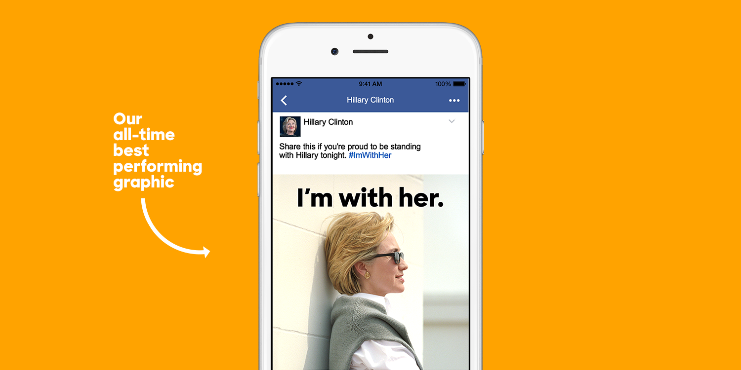
We took time to review every single piece of content about Hillary Clinton that we pushed on social media. We evaluated performance through metrics reporting and by seeing how content was being adopted by supporters. It was important to be aware of what was resonating with supporters, to notice when supporters were making certain graphics their profile photos, or when some of our more creative supporters started imitating our graphics to push their own messaging about Hillary.
Our cumulative social media audience for the campaign was over 13 million. This meant we needed to diversify our content through language and visual style to ensure that we were effectively reaching everyone.
Having the ability to create unique content for Hillary and Hillary for America allowed us to go deeper on certain issues and reach the correct audience by doing so.
Hillary Clinton
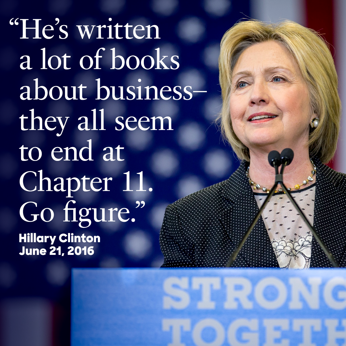
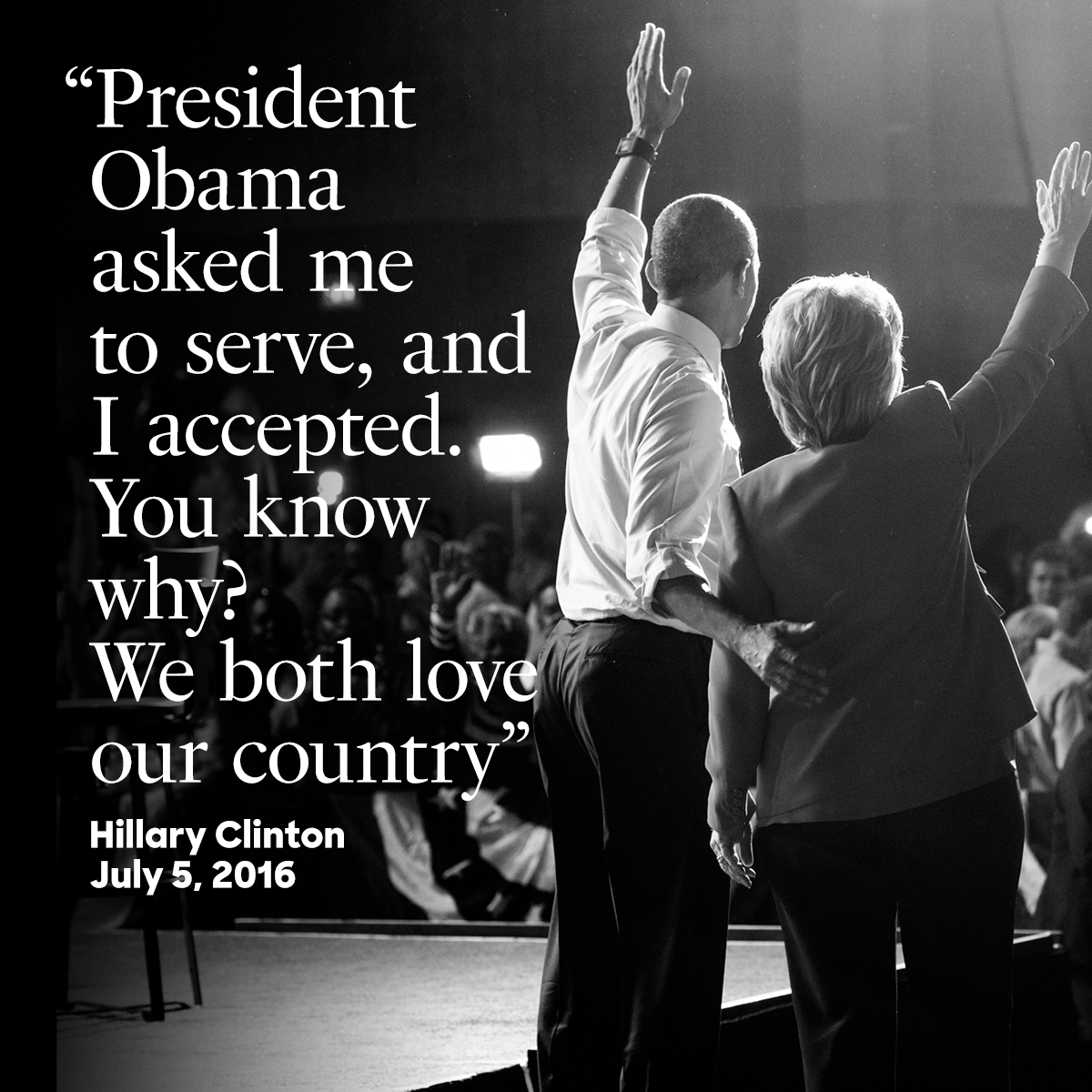
The most important part about designing for @HillaryClinton was making sure every single graphic reflected our candidate. We introduced the typeface Fournier for quotes directly from Hillary, as it most closely reflected her own personality: warm, engaging, tenacious, and above all, presidential.
Hillary for America
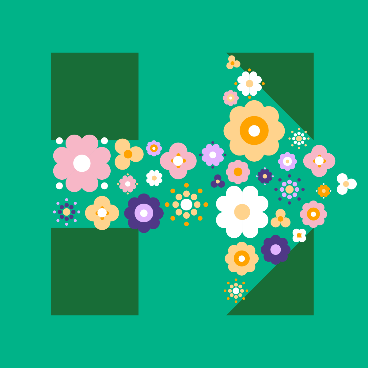
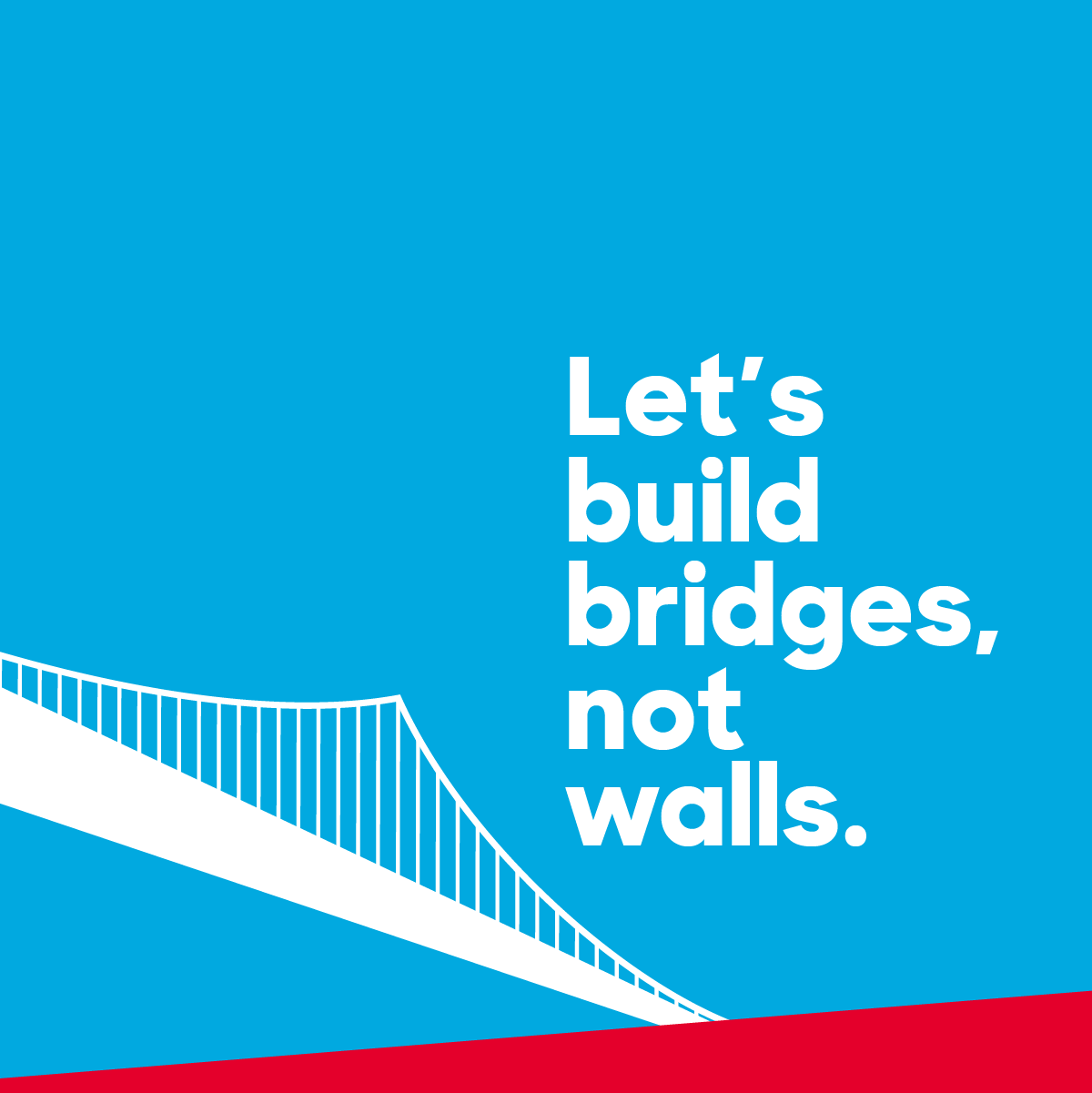
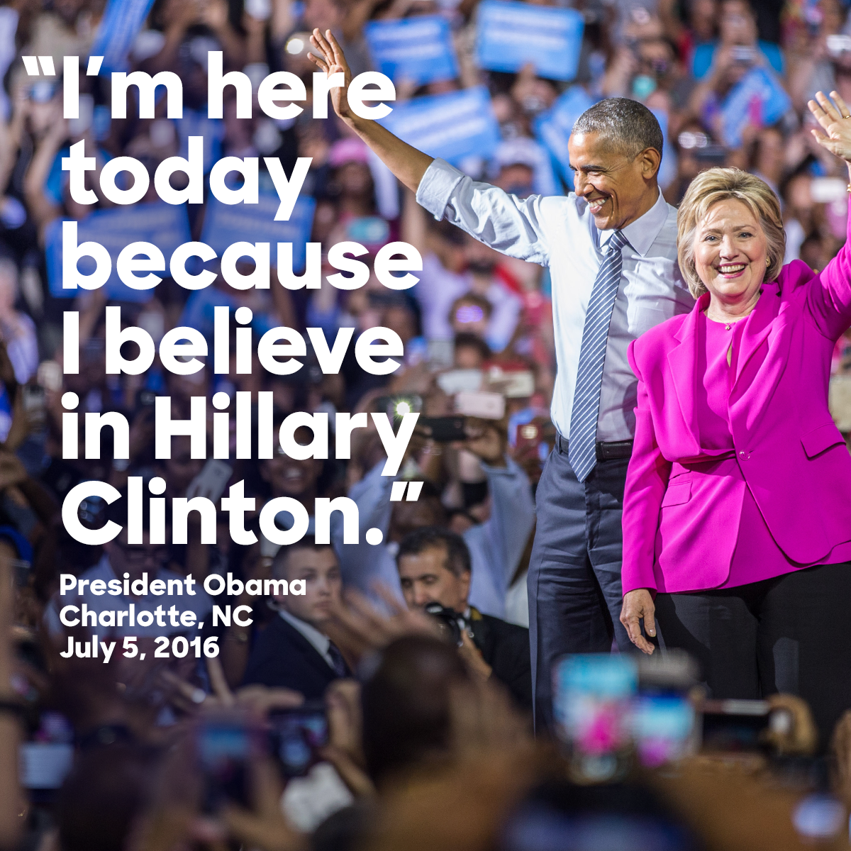
As the voice of the campaign, @HFA was able to be more celebratory in content and design. The Hillary for America account was warm and playful while still being informative, which embodied the nature of the campaign and the staff working behind the scenes.
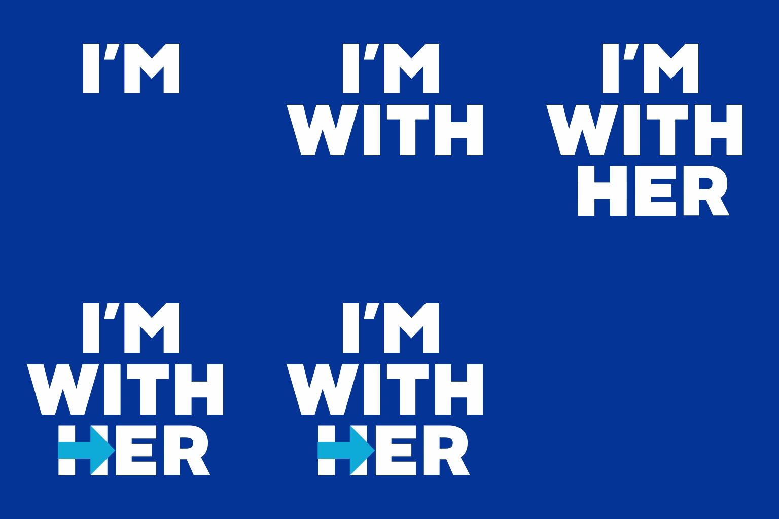
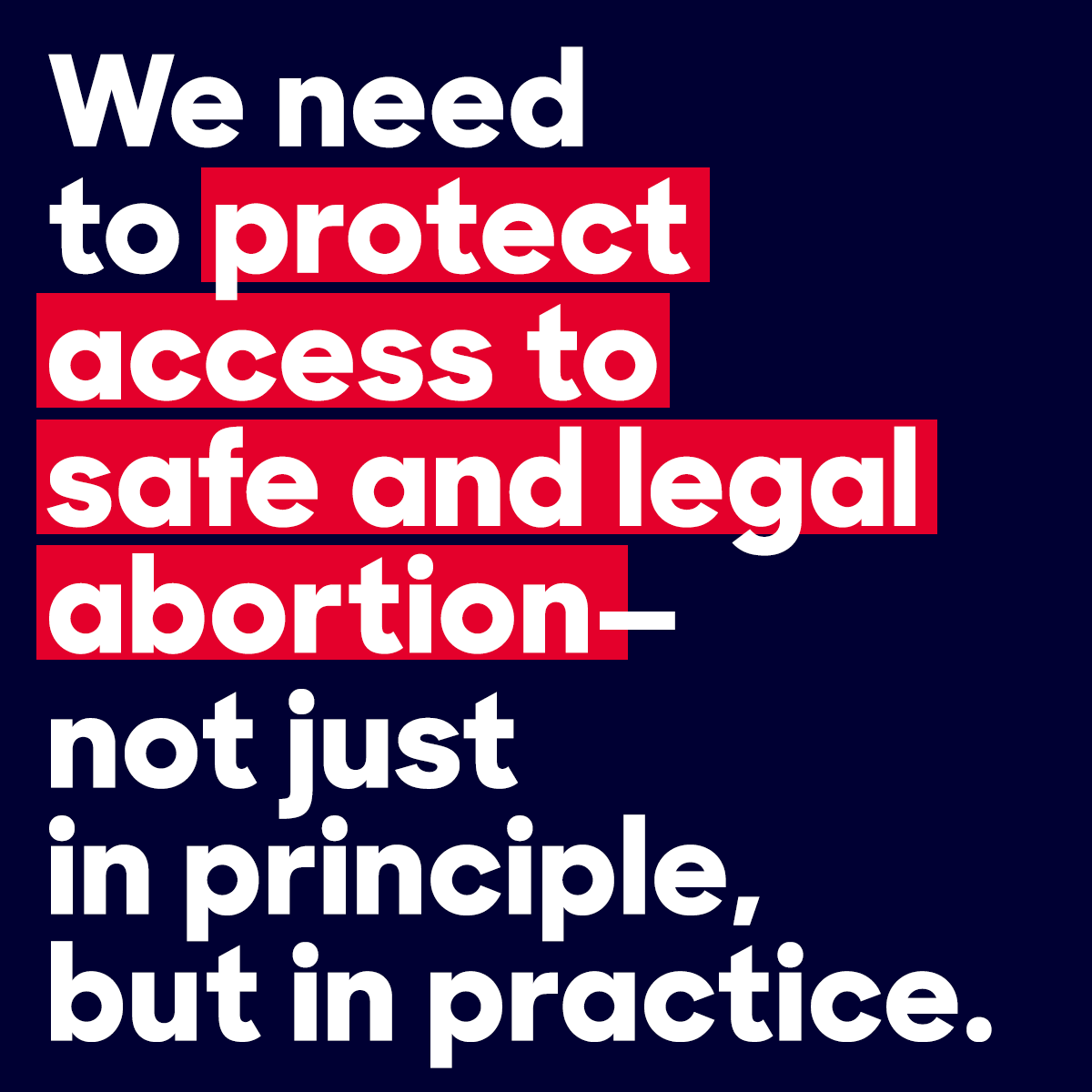
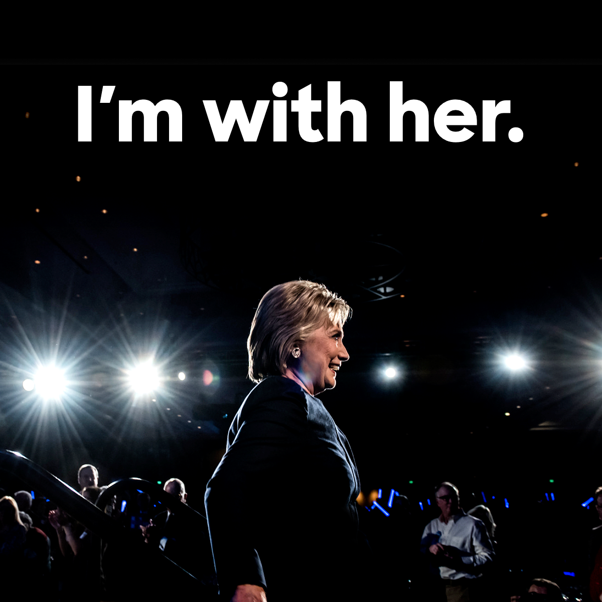
We designed hundreds of social graphics over the course of the campaign. Here’s a collection of our favorites.
Collaborators
Team Photo
Team Social
Team Video
Jackie Lay, Illustration

