The H’s
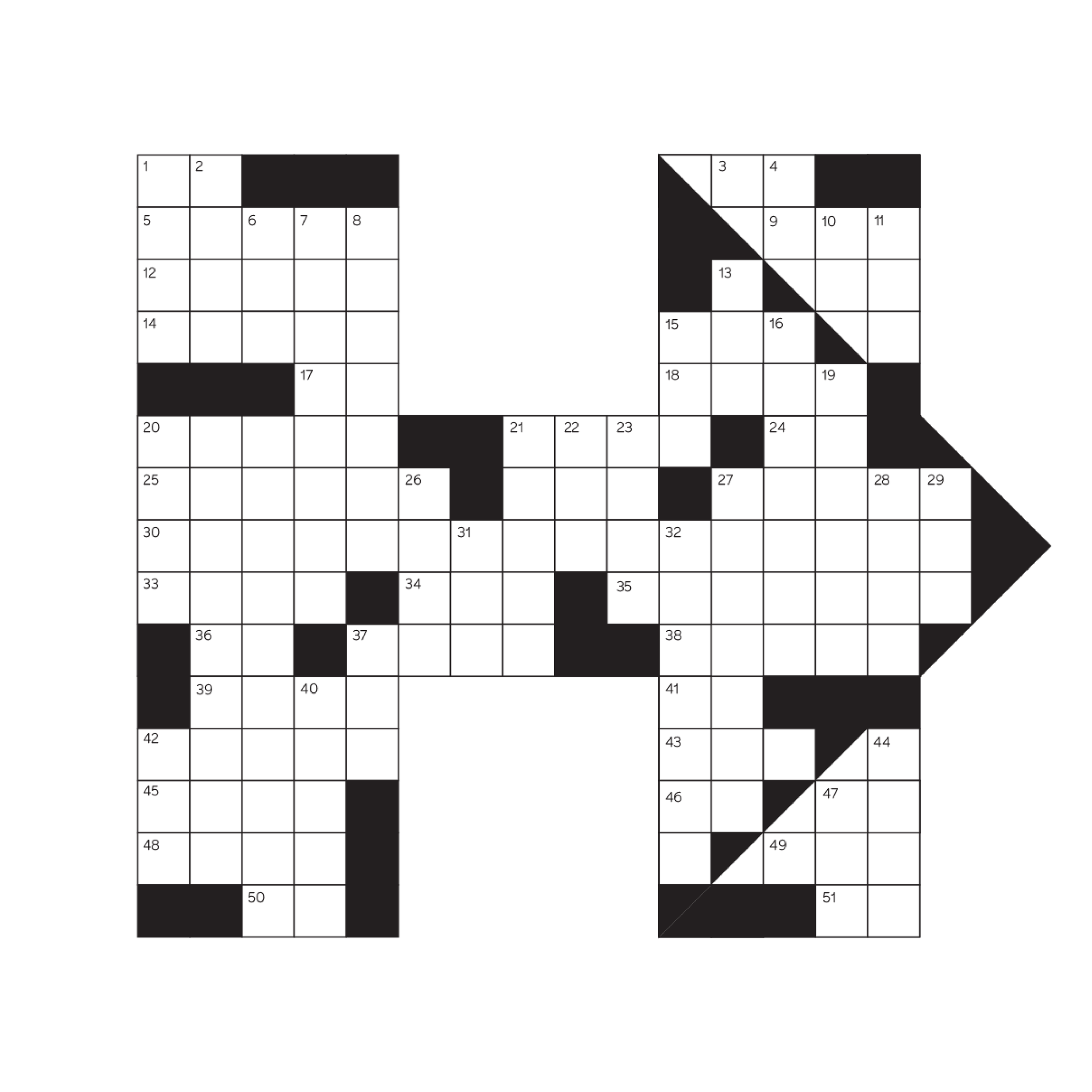
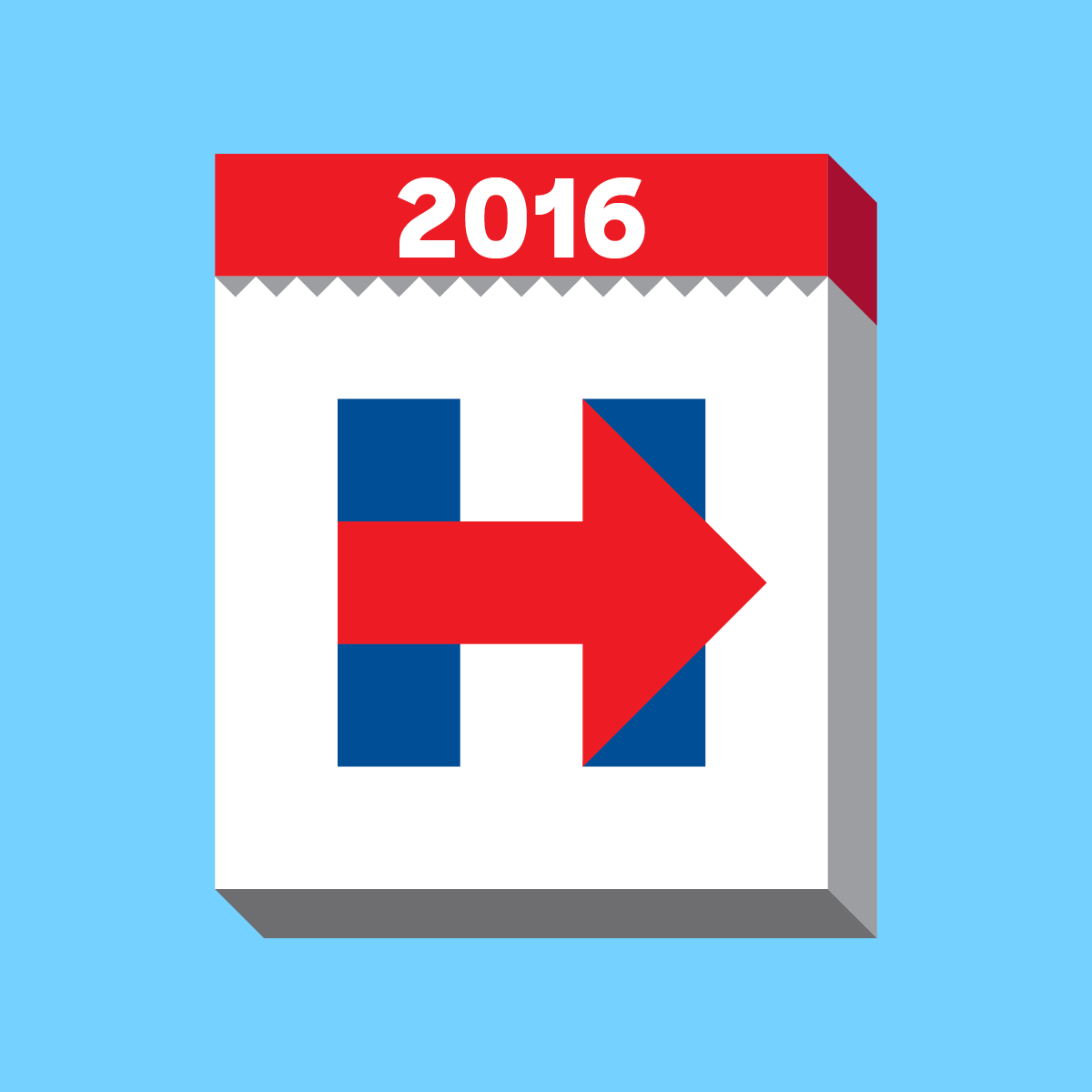
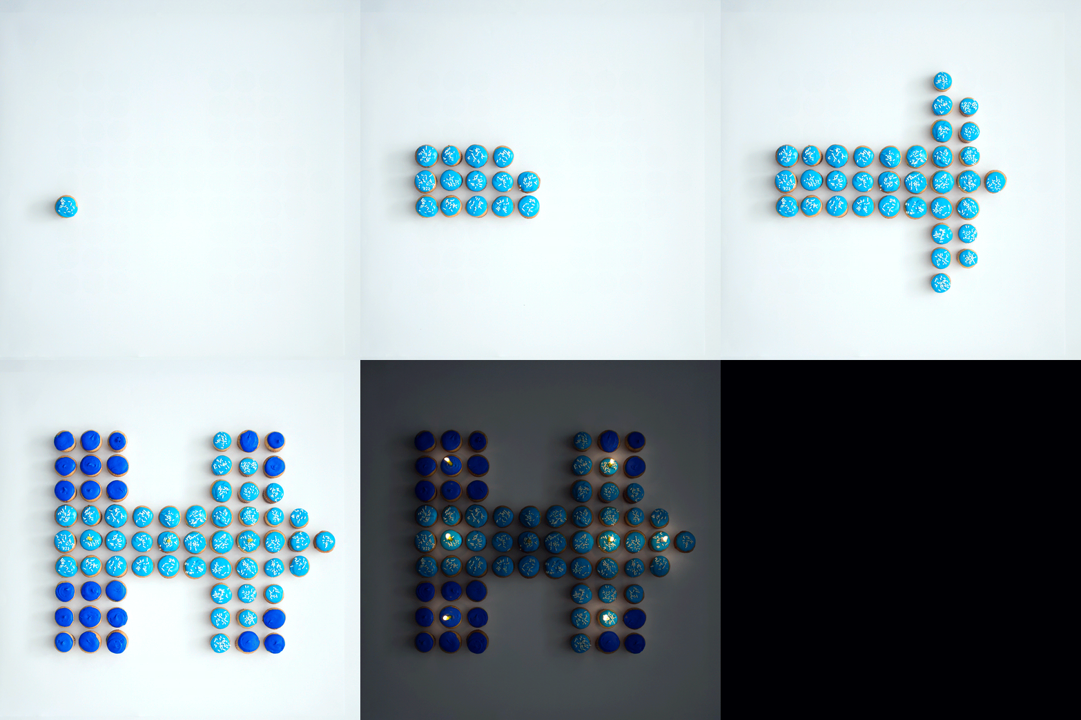
Our iconic H-mark, designed by Michael Bierut and his team at Pentagram, represented the strength of our candidate and her dedication to ensuring a better future for America. Its ubiquitous presence throughout the campaign attested to its versatility and symbolic power regardless of color, size, or even medium.
Based on a perfect nine-square grid, its simplicity allowed for endless variations and expressive interpretations. Their playfulness and diversity exemplified the campaign’s friendly and inclusive spirit. (Click on the H’s to view their associated social media posts.)

Collaborators
Team Social
Team Tech
Press
AIGA Eye on Design, Hey internet, shut up about Hillary Clinton’s campaign logo: Milton Glaser is here with the final word
Brand New, Hillary, Michael, and Lester
NPR, Panned when it first came out, the Clinton logo is saying something now
Quartz, It’s official: Hillary Clinton’s logo is actually perfect


